Show My Colors: Color Palettes
- 4.2
- Rating
- 1.00M
- Installs
- Free
- Price

 Analysis by App-foxy
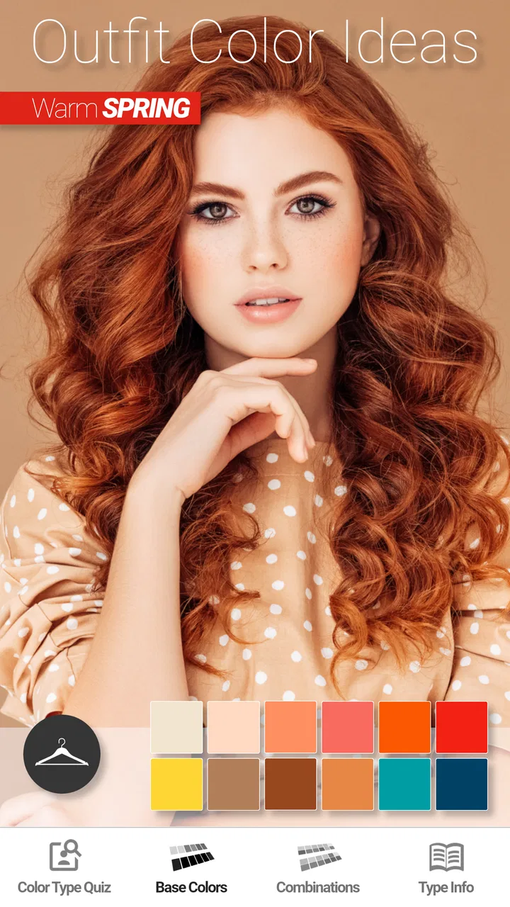
I tried Show My Colors: Color Palettes as a practical beauty companion rather than treating it like a simple mood-board app. Its purpose is straightforward: help me choose seasonal color palettes while I shop for clothes and makeup. That sounds modest, but it can be useful when I am standing in front of a rack of similar shades and want a more consistent answer than “this looks nice under store lighting.”
The app comes from BrilliantSeasons and sits in the beauty category. It is free to install, suitable for Everyone, and has reached over one million installs. Its average is 4.2 from around 2.6 thousand ratings, which suggests that many people find the central idea worthwhile, although it is not a universal replacement for professional color analysis or personal styling advice.
Using the palette in real shopping situations
I find this app most useful when I decide what I’m shopping for before opening it: a work top, a lipstick, or an accent to go with a coat I already own. In this section, I’ll focus on turning a palette into a practical shortlist rather than treating every suggested shade as a rule. That approach also makes it easier to spot when fit, occasion, or personal comfort should outweigh color guidance.
You May Also Like

 Blood Strike: 2.5 Anniversary
Blood Strike’s Loadouts Turn Every Drop Into a Tactical Gamble
A close look at Blood Strike’s custom loadouts: how fast access to signature weapons reshapes its battle royale rhythm, rewards preparation, and narrows the gap between fights.

 Pandora - Music & Podcasts
Pandora’s Music Is Easy to Start, but Harder to Recover
Pandora’s strength is its low-effort path from a seed to a station. Its weak spot is how much confidence it asks you to place in connection, setup, and quiet recovery.

 8 Ball Pool
 Is Built on Rivalries, Rematches, and Routine
A close look at the rivalries, rematches, shared routines, and unanswered safety questions that turn a quick pool match into a persistent mobile community.

 Samsung Music
’s Quiet Strength Is Playing What You Already Own
Its reach comes less from spectacle than from dependable access to a personal library. That simplicity is both the app’s strongest retention engine and its ceiling.

 AccuWeather: Weather Radar
AccuWeather Review: A Quick, Clear Forecast for Everyday Decisions
For everyday plans, the best forecast is the one you can understand quickly. AccuWeather makes rain timing, radar, and local conditions easy to act on, with a few trade-offs.

 Hill Climb Racing
Why Hill Climb Racing Still Turns Crashes Into One More Run
A tiny car, a bumpy hill and one more upgrade: Hill Climb Racing keeps resurfacing because its simple chaos makes every near-miss feel personal.
More From Our News Desk
View All News


A useful shared-device scenario
The most convincing use case for me was a shared shopping moment. Imagine two people getting ready for an event, using one phone while comparing a jacket, lipstick, or scarf. Instead of opening several unrelated inspiration boards, one person can use the app as a reference and the other can hold up possible choices. That makes the conversation more concrete: are we looking for a warmer neutral, a softer contrast, or a brighter accent?
This works especially well when the phone is passed between people who already know one another’s preferences. A partner might use the palette while shopping for a gift, or a friend might check whether a makeup shade belongs in the range they usually enjoy wearing. The app does not need to become a social network to be useful in this situation. Its value is in giving a shared visual starting point.
There is an important practical limit, though. A single device is not the same as a shared account or a household profile system. I would not treat the app as a place to manage several people’s beauty identities unless each person is comfortable with the same device and the same app context. For quick coordination, that is fine. For strict separation between users, a personal phone or a separate alternative may be cleaner.
What I would do before opening a shopping app
I found the palette most helpful before browsing products, not after filling a basket with random colors. I would first decide what I am shopping for: everyday clothing, an occasion outfit, lipstick, blush, or a small group of coordinating pieces. Then I would use the app to narrow the visual direction. This prevents the common mistake of judging every item separately and ending up with a wardrobe full of attractive colors that do not work together.
A small but useful habit is to choose one main neutral and one accent rather than trying to use every shade shown. For example, I might begin with a dependable base color, then select one brighter tone for a top, accessory, or makeup detail. The palette becomes a filter instead of a rulebook. That distinction matters because seasonal color advice can become restrictive when people assume every recommended shade must be worn together.
For makeup shopping, I would use the app to compare families of shades rather than search for one supposedly perfect product. Store lighting, formula, skin preparation, and natural lip color can all change the final result. A palette can help me avoid a direction that feels obviously wrong, but it cannot replace trying a product safely and checking it in natural light.
Setup boundaries and realistic expectations
The app is easier to understand when I approach it as a visual guide, not as a scientific measurement tool. Color analysis is affected by lighting, camera displays, surrounding colors, hair color, and personal taste. Even if a shade sits comfortably inside a suggested seasonal range, I may still dislike wearing it. Conversely, a color outside the range may look excellent because of contrast, styling, or the way I combine it.
That is why I would avoid making a final purchase based on the screen alone. I use the app to create a shortlist, then check the actual garment or cosmetic in daylight. For online shopping, I would compare several product photos and read the description carefully because names such as rose, beige, berry, or olive are not consistent between brands.
Another boundary is household privacy and account expectations. If several people use the same phone, I would make sure everyone understands that the app is being used as a reference for the current shopper. I would not assume that the app offers separate family spaces, automatic profile switching, or parental controls. Those are useful features in some shared-device products, but they should not be presumed here.
The minimum operating system is Android 9, and the current version is 1.53. That makes compatibility worth checking before planning a shared household setup, especially if one person uses an older device. On a supported phone, the basic idea should be easy to test without committing money immediately because the app itself is free.
Coordinating clothes and makeup without overmatching
One of the better ways to use the app is to coordinate categories without making them identical. I might choose a clothing neutral from the palette, then use a related but slightly stronger shade for makeup. The result can feel intentional without looking like every item was selected from one paint sample.
A second workflow is to start with an item I already own. If I have a coat, dress, or pair of trousers that I wear often, I can use the palette to find supporting colors for the pieces that will sit near it. This is more practical than starting with an abstract seasonal label because it connects the app to my actual wardrobe. It also helps reduce unnecessary purchases: I am looking for gaps and combinations, not simply collecting colors.
For a shared shopping trip, I would save the discussion in plain language: “we need a soft neutral for work,” “we want a warmer accent,” or “we are avoiding very high contrast.” That keeps the app from taking over the decision. The palette supports coordination, while the wearer still decides what feels comfortable, appropriate, and genuinely appealing.
It is also worth separating color preference from dress-code needs. A palette may suggest attractive shades, but an office, ceremony, uniform requirement, or cultural setting can impose different priorities. In those cases, I would use the app to refine options inside the practical boundary rather than allowing the seasonal classification to dictate the entire outfit.
Age context, trust, and responsible use
The Everyone rating makes the app approachable for households where younger users may encounter it on a shared device. Even so, I would frame it as a creative shopping aid rather than an authority on appearance. Children and teenagers can enjoy experimenting with color, but adults should avoid presenting a palette as a judgment about attractiveness or a fixed rule about what someone is allowed to wear.
This matters because beauty tools can quietly become confidence tools. I prefer language such as “let’s see which shades you enjoy” instead of “this color is wrong for you.” The app is more positive when it expands choices and helps someone notice combinations they had not considered. It is less helpful when it turns a flexible styling idea into a test that the user feels they can fail.
For makeup, age and supervision still matter even though the app is rated for Everyone. The rating describes the app’s content context; it does not replace sensible household rules about cosmetics, allergies, hygiene, or purchases. I would not let a child treat palette suggestions as permission to use every product they see online.
Trust also applies to shared recommendations. If one person is using the app for another, the final choice should remain with the person who will wear the item. A partner or friend can offer ideas, but the palette should not become a way to pressure someone into a color they do not like. That is a small distinction, yet it makes the shared-device experience much more comfortable.
Where it beats ordinary alternatives
The usual alternative is a general image search, saved social posts, or a large inspiration board. Those options are better when I want outfit ideas, brand discovery, or examples of complete looks. They can show texture, silhouette, styling, and context in ways a color-focused app cannot. Their weakness is that the color guidance is often inconsistent, and I can easily save attractive images without learning how the colors relate.
Show My Colors: Color Palettes is more focused. I would choose it when I want a compact reference while shopping rather than an endless stream of inspiration. It is also more useful than relying on memory, especially when comparing several products online. The trade-off is that its narrower purpose means I should not expect detailed wardrobe planning, product reviews, or a full personal styling service.
A professional color consultation is the stronger option for someone who wants a nuanced assessment based on their features, preferred contrast, lifestyle, and existing wardrobe. A consultant can explain exceptions and help with the overall effect of an outfit. This app is the more convenient choice for casual exploration and repeated shopping decisions, but convenience should not be confused with the same level of personal judgment.
Free palette websites and generic color-picker tools can also be useful. They may offer broader customization, while this app’s appeal is the seasonal framing. If I already understand color theory and only need to sample exact digital colors, another tool may suit me better. If I want a simple beauty-oriented guide that connects clothing and makeup, this app has the clearer purpose.
Cost, version, and the decision to upgrade
There is no purchase required to try the app because it is free. Optional in-app purchases range from $2.99 to $4.99 per item, so I would spend time with the free experience before deciding whether any paid addition genuinely improves my routine. The right question is not whether a premium option exists, but whether I will use the palette often enough to justify it.
For occasional shopping, the free entry point is a strong advantage. I can test the concept before buying clothes or cosmetics around it. For someone who regularly plans outfits, experiments with makeup, or wants a repeatable reference for gifts, a paid item may be easier to justify if it provides something they personally find valuable. I would still avoid purchasing simply because I feel pressured to complete the app.
The current version, 1.53, is relevant for anyone comparing experiences across devices or reading older advice. App interfaces can change, so I would judge the version available on my own phone rather than relying on screenshots from years ago. Since the app was released on April 7, 2020, it has had time to establish a clear identity, but its focused concept remains more important than its age.
Who should use it and who should skip it
I would recommend it to a shopper who often hesitates between similar shades, wants a shared reference during clothing or makeup decisions, or is beginning to explore seasonal palettes without paying for a consultation. It is particularly handy for building a small, coordinated wardrobe because it encourages me to think in relationships between colors rather than isolated purchases.
I would also recommend it to a friend who enjoys beauty experimentation but needs a little structure. The app can turn an unfocused search into a manageable exercise: choose a base, identify a few supporting shades, then check real products in suitable lighting. That is enough guidance to make shopping less random without taking away personal taste.
I would skip it if I want precise professional analysis, detailed product comparisons, body-shape styling, or a complete outfit planner. I would also skip it if I dislike seasonal color categories or prefer choosing clothes entirely by texture, cut, cultural tradition, or personal mood. The app cannot solve a problem I do not actually have, and using it may add unnecessary rules to a wardrobe that already works.
It is not the best choice for a household that needs firm account separation or specialized family management. A shared phone can support casual coordination, but people with different preferences should not assume that one palette workflow will serve everyone equally well. In that case, individual use on separate devices is the safer arrangement.
My household verdict
After using it as a shopping aid, I see Show My Colors: Color Palettes as a focused, approachable tool rather than a definitive beauty authority. Its strongest quality is the way it gives a shared conversation a visual center: instead of arguing over vague impressions, I can discuss a smaller set of color directions and then test them against real clothes, makeup, lighting, and comfort.
The app works best when I keep its advice flexible. I would use it before shopping, bring its suggestions into a fitting room or online shortlist, and make the final decision with my own eyes. I would not let a seasonal label override a favorite garment, a dress code, or the wearer’s confidence.
BrilliantSeasons has made a free beauty app that is easy to recommend for casual color exploration, especially in a household where friends or relatives sometimes shop together. The Everyone rating and low barrier to entry make it approachable, while the optional purchases mean frequent users can decide for themselves whether extra value is worth paying for. My final view is positive, with one clear condition: use the palette as a helpful starting point, not as a verdict on what anyone is allowed to wear.
FAQs for Show My Colors: Color Palettes
01What is Show My Colors: Color Palettes?
Show My Colors: Color Palettes is a mobile application designed to help users create, manage, and explore color palettes. It's ideal for designers, artists, and anyone interested in color theory. The app provides a user-friendly interface to experiment with different shades and tones, offering inspiration for various creative projects.
02How does the app help in creating color palettes?
The app offers intuitive tools for creating custom color palettes. Users can select colors using a color wheel, adjust shades with sliders, or input specific color codes. Additionally, the app provides suggestions based on color theory principles, such as complementary and analogous colors, helping users craft harmonious palettes with ease.
03Is Show My Colors suitable for professional use?
Yes, Show My Colors is suitable for both amateur and professional use. It offers advanced features such as exporting palettes in multiple formats (like HEX, RGB, and CMYK) and integrating with design software. Professionals in graphic design, interior design, and fashion find it especially useful for its precision and versatility.
04Does the app require an internet connection?
Show My Colors can be used offline for most of its features, including palette creation and editing. However, an internet connection is required for certain functionalities such as syncing with cloud services, accessing community-shared palettes, and receiving updates. This ensures users can work seamlessly both online and offline.
05Are there any costs associated with using Show My Colors?
The app is available for free with basic functionality. However, it offers in-app purchases for premium features, such as additional color libraries, advanced export options, and ad-free experience. Users can choose to subscribe for a monthly fee or make a one-time purchase, depending on their needs.
Pros
- User-friendly interface for easy navigation.
- Wide range of color palettes to explore.
- Real-time color suggestions for projects.
- Save and organize favorite palettes easily.
- Works offline for on-the-go access.
Cons
- Limited free features without subscription.
- Occasional lag on older devices.
- No direct export to design software.
- Ads can be intrusive in free version.
- Lacks advanced customization options.

Show My Colors: Color Palettes
Gallery